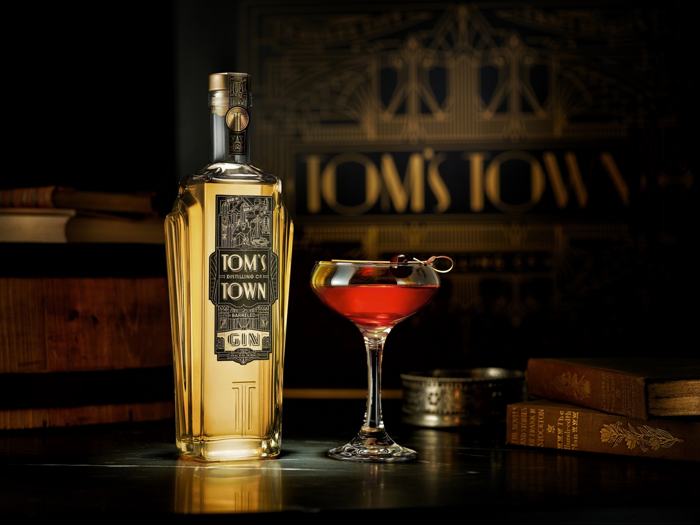
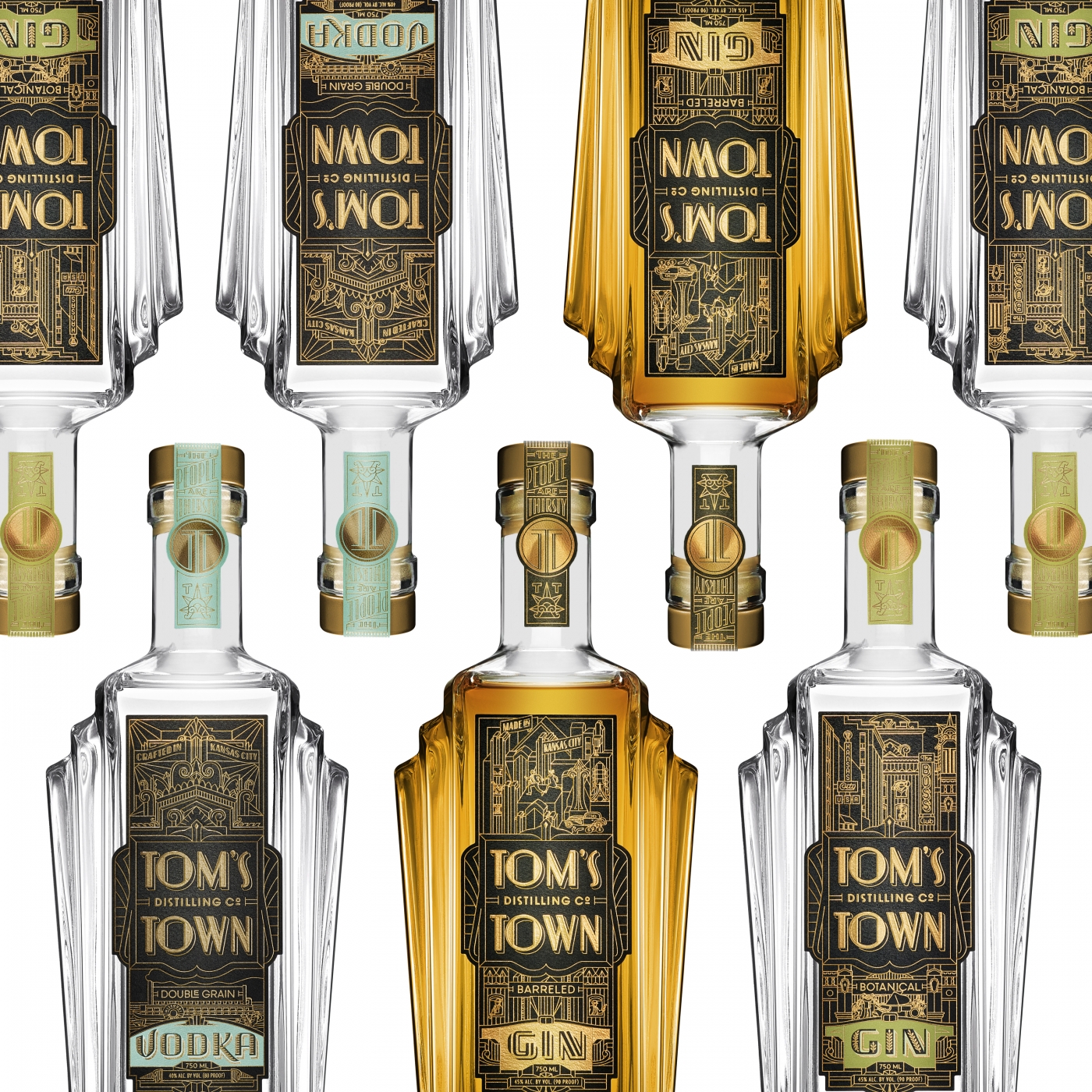
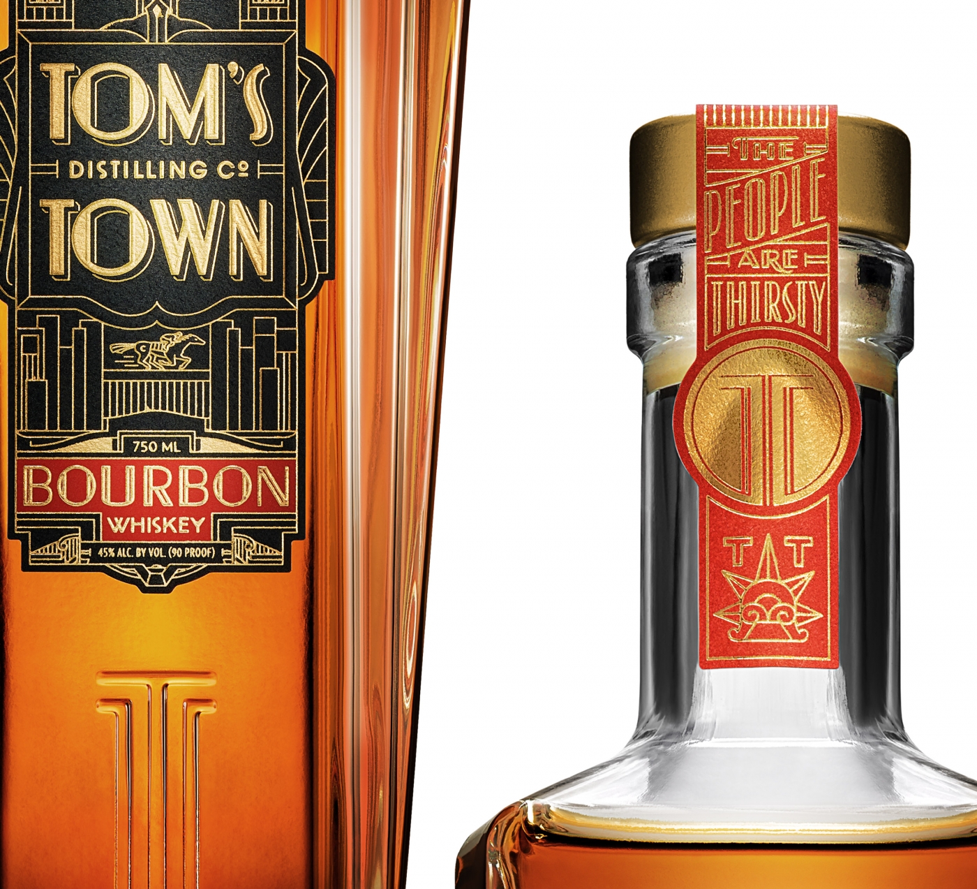
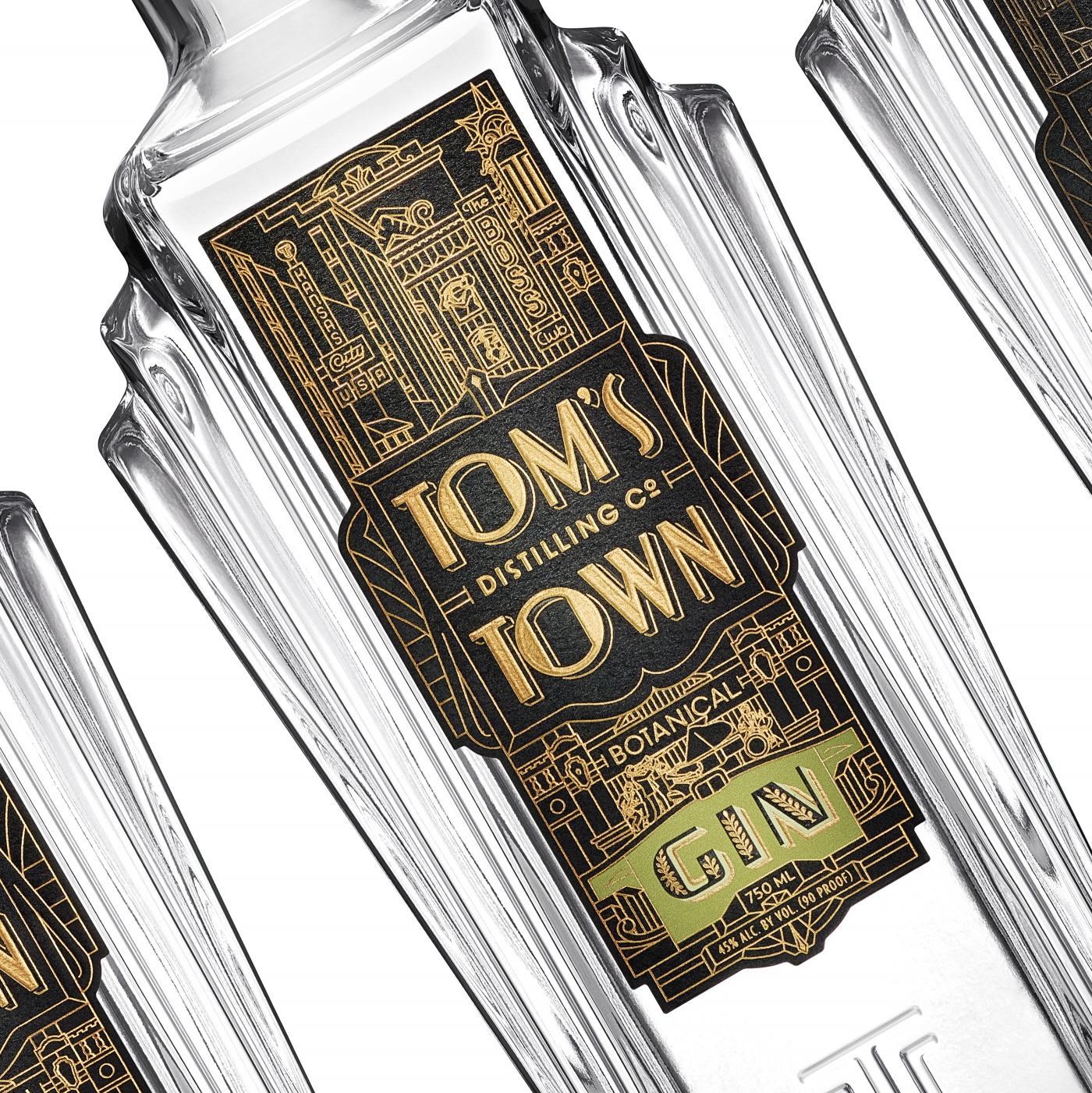
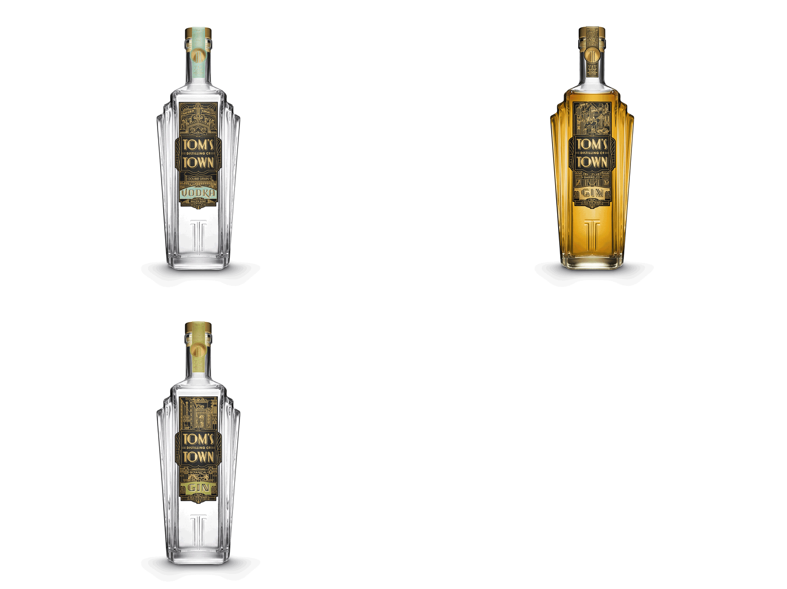
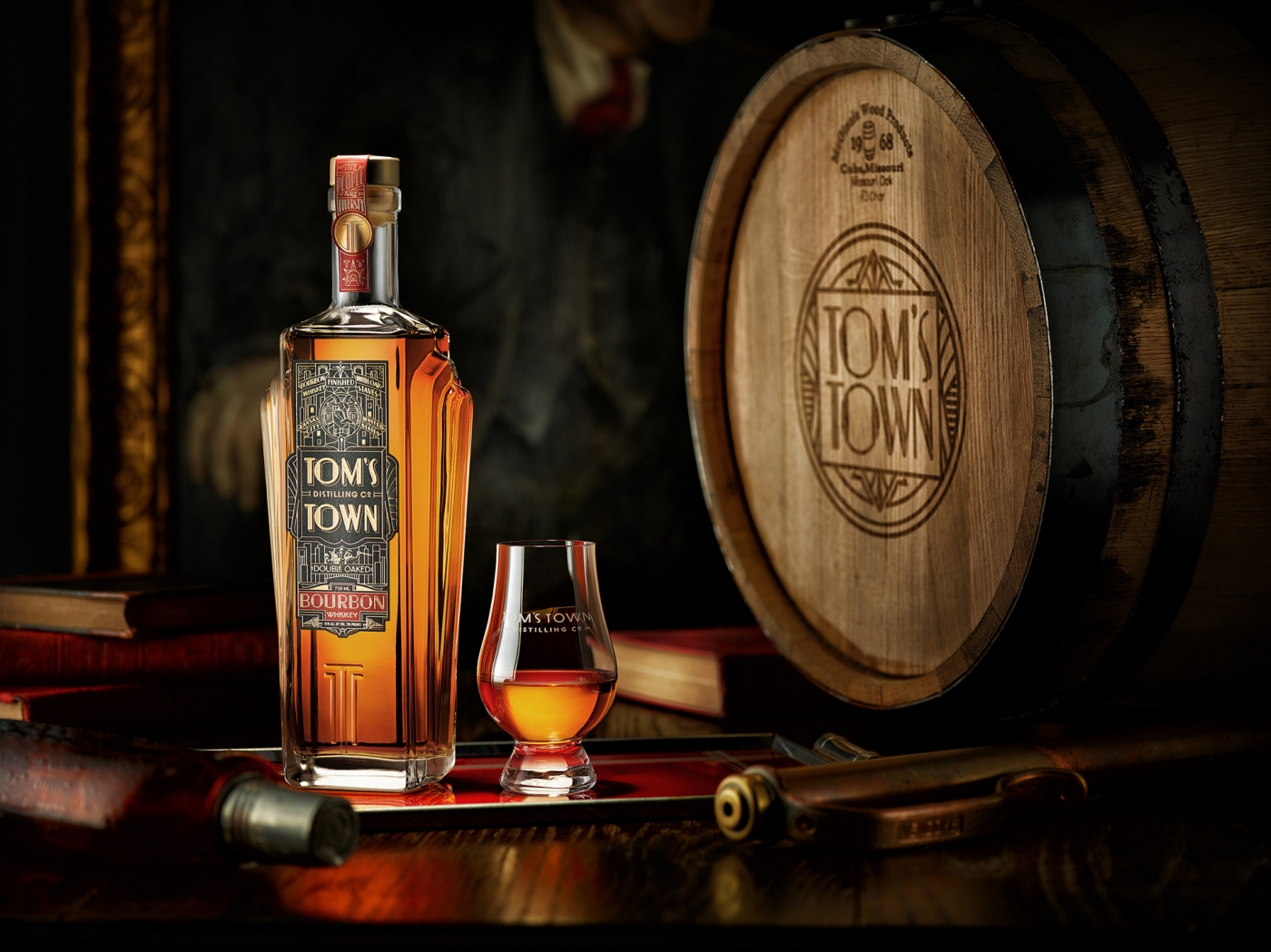
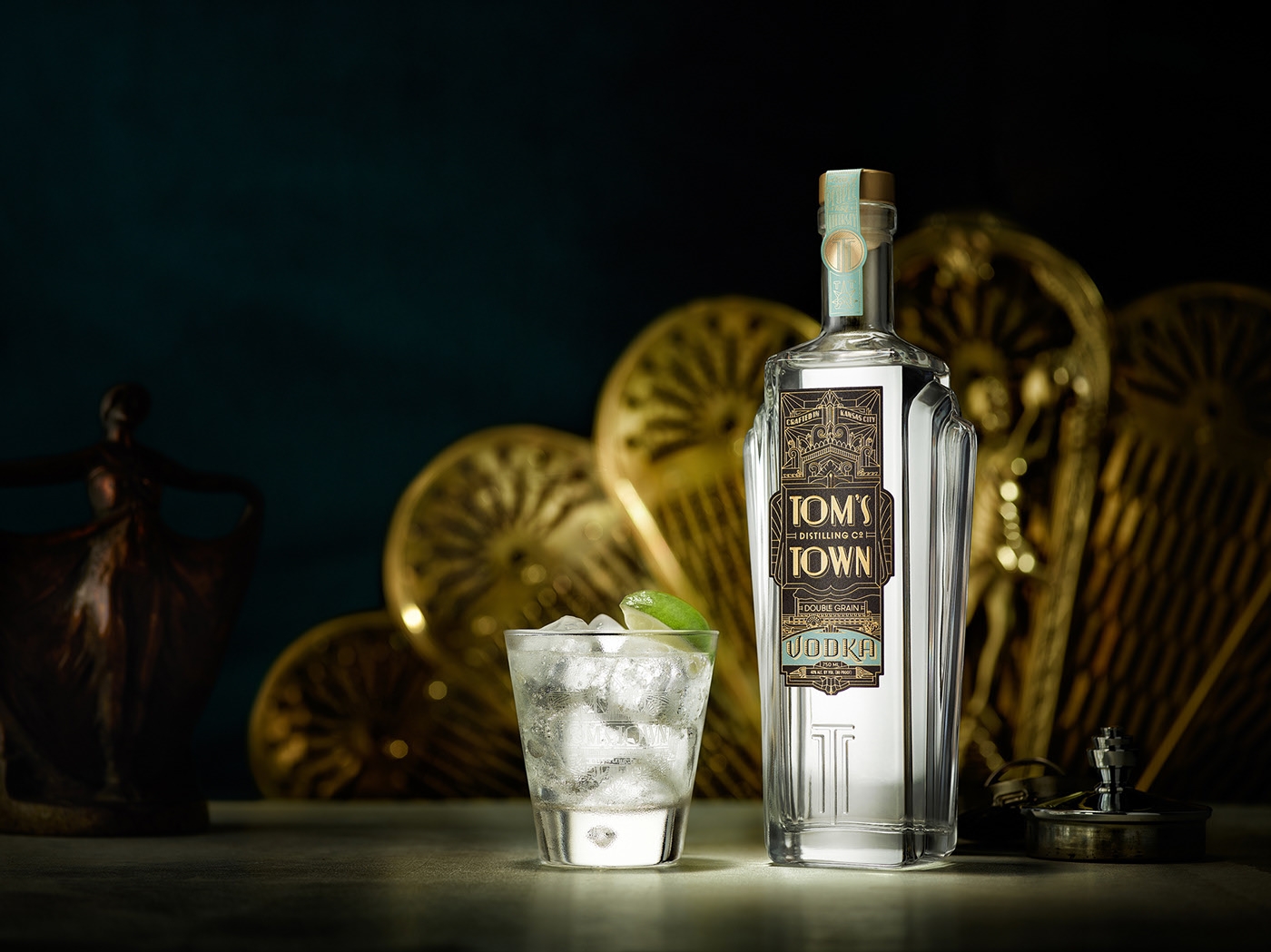
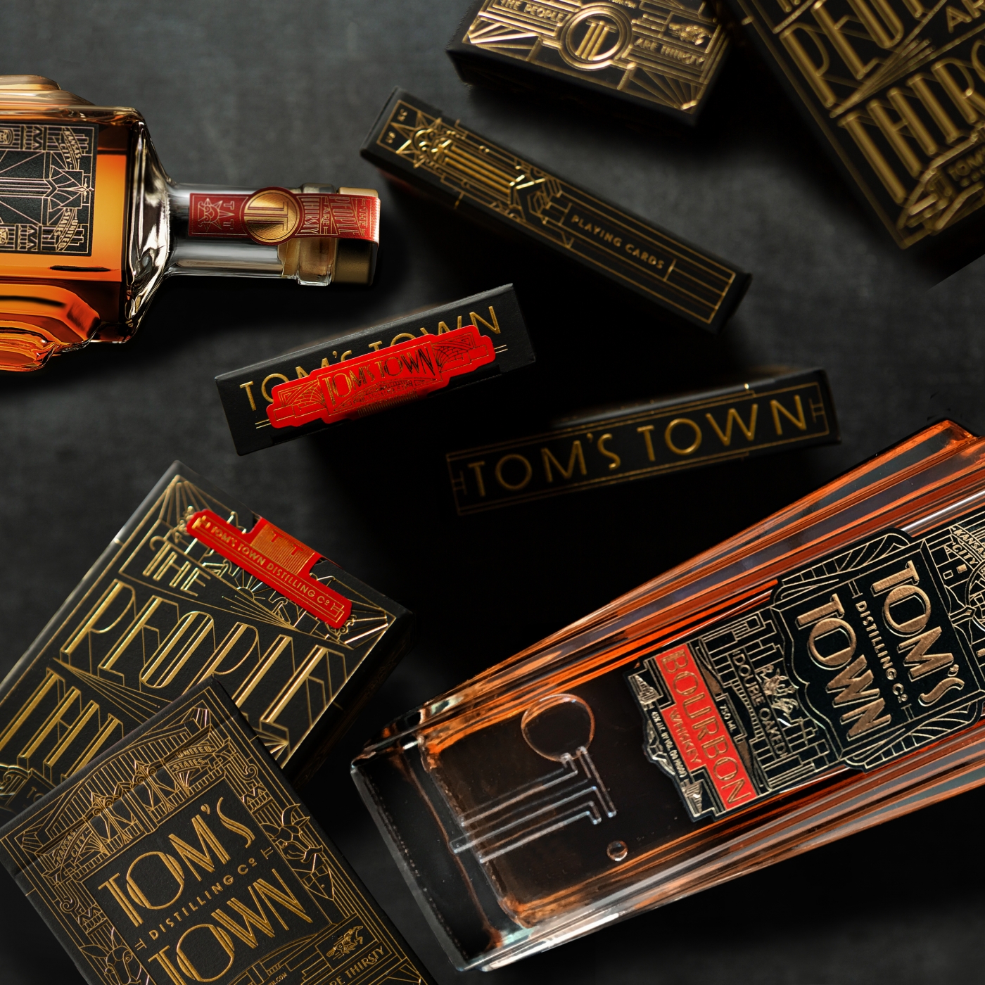
After developing the brand’s strategy and visual brand language for the Kansas City distillery, Kevin Cantrell Studio with Satellite Office were tasked with updating the brand with a custom glass bottle that reflected the distillery’s prohibition roots. Pulling from the art deco architecture prevalent at the time, the custom Tom’s Town glass design evokes the grandeur and magnificence of this “Paris of Planes” and reinforces the existing decadent label branding. The towering, symmetrical balustrades that flank the bottle grew from the dramatic geometry of Kansas City buildings, while the embossed design of Tom’s Town’s double TT monogram and slogan, “The People Are Thirsty”, further distinguish the brand beyond expected stock bottle packaging.
